Why Bigger Public Screens Aren’t Always Easier to Read
Why bigger public screens aren’t always easier to read: see how distance, layout, and contrast shape what passersby can understand at a glance.
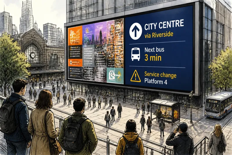
A digital sign can fill a building facade and still be hard to read from across a plaza. Bigger public screens aren’t always easier to read because the size of the display does not determine the size or clarity of the message a passerby sees. Distance, layout, viewing angle, and contrast all shape legibility.
That distinction matters on streets, in transit halls, and outside venues, where people may glance at a display while moving. A large panel can make room for content, but it can also tempt designers to add more words or competing elements. The useful question is not simply how large the screen is, but what someone can make out from the place where they are likely to see it.
Screen size and readable detail are different things
A screen’s physical dimensions describe its outer frame. Readability depends on the details within that frame: letter size, line spacing, the amount of information shown, and how sharply those elements appear from a particular viewpoint. A large sign with small type can be less legible than a modest display with a brief, well-spaced message.
Think of a street sign like a note on a refrigerator. A bigger refrigerator does not make the handwriting clearer; you still need to stand close enough to see the letters. A public display works on the same basic principle, except its audience may be moving, farther away, or looking only briefly.
Resolution also affects what physical size accomplishes. If content has coarse edges or fine details that blur at the intended viewing distance, expanding the screen does not automatically fix the problem. The displayed elements must remain clear where people will see them.
There is a difference between making a display visible and making its message readable. A bright, colorful panel may catch someone’s eye without allowing them to identify a place name or understand a direction. Attention can begin with a glance; legibility requires the important information to survive it.
Viewing distance sets the scale of the message
The same screen looks different from the curb, the far side of an intersection, and a nearby queue. As a viewer moves away, letters occupy less of their field of view. Fine strokes, punctuation, and narrow gaps can become difficult to distinguish, especially if someone is walking past rather than facing the display directly.
Start with the likely viewing position. Is the display meant for people approaching along a sidewalk, waiting beneath a station canopy, or crossing an open square? Each position changes how much time a viewer has, how far away the screen appears, and whether architecture or street activity interrupts the view.
A sign intended for a distant approach usually benefits from fewer words and more prominent type. A nearby information screen can carry more detail if people are expected to stop, but the layout still needs a clear first point of entry. Extra screen area helps only when it supports the viewing conditions rather than inviting denser copy.
Angle matters too. A screen viewed from the side may appear narrower, and reflections or nearby lights can make parts of its image harder to distinguish. Consider the audience’s ordinary path and orientation, not only how the display looks in a straight-on mockup.
Layout determines what the eye can sort out
Even when every word is large enough to see, a crowded layout can slow comprehension. A viewer has to work out what to read first, which lines belong together, and whether an image or icon changes the meaning. In a public setting, that sorting competes with movement, conversations, traffic, and other signs.
Hierarchy gives the eye a useful route through the message. A destination or action can take the most prominent position, supporting details can follow, and decoration can stay secondary. Spacing, alignment, and grouping show which pieces belong together; making one line larger is not enough on its own.
Consider a transit display with a platform change, a route label, and a service note. If all three have equal prominence, viewers must decide for themselves which matters most. A clearer arrangement makes the route easy to identify, then places the change where it can be found without scanning an unrelated block of copy.
White space is part of that arrangement. It separates groups and gives letters room to remain distinct; it is not simply unused screen area. When every corner is filled, text and symbols can blur together even if the panel is expansive.
Contrast protects letters from their surroundings
Contrast describes how clearly foreground elements differ from the background. Strong contrast helps text remain distinct, while weak contrast can make it fade into a bright scene, patterned image, or changing background. Color choice alone does not settle the issue: colors that look different in a palette may be hard to distinguish under particular lighting or for some viewers.
Busy imagery is a common source of interference. A photograph behind text can create competing patches of light and dark, making some parts of a word clearer than others. A solid or lightly textured text panel can preserve separation, especially when a message must be understood quickly.
Ambient conditions change what viewers perceive. Daylight, shade, nighttime lighting, reflections, and the display’s own brightness all affect the apparent relationship between text and background. A design that seems clear in a dim studio preview may lose definition outdoors, so review it in the actual surroundings and from likely viewing positions where feasible.
Contrast works alongside type weight and spacing. Thin strokes may vanish against a complex image, and tightly packed lines may be hard to separate even if the colors are distinct. Bolder lettering can help, but overly heavy type or cramped spacing may create another problem; the aim is to keep letter shapes and word groups distinct.
What should you check before judging a public display?
Does a larger screen make small text readable?
Not by itself. If the text remains small relative to the display or is viewed from far away, expanding the outer screen may not make the letters easier to identify.
Should every public screen use a short message?
No; the amount of content should fit the audience’s likely distance, time, and purpose. A glance-oriented sign needs a clear main message, while a screen meant for people who stop can organize extra detail into readable groups.
Why can bright text still be hard to read?
Brightness does not ensure clear separation from the background. Glare, reflections, busy imagery, or weak contrast can make letter shapes difficult to distinguish even when the display attracts attention.
What should be checked before a display is installed?
Check likely viewing routes, distances, and angles, then assess text size, layout, and contrast from those positions. Also consider surrounding light, reflections, and whether people can pause safely to read more detailed content.
Use the viewing position as the design starting point
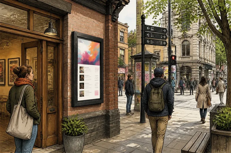
Imagine a neighborhood venue planning a large screen beside a plaza entrance. Its starting point is a short direction for people approaching from the sidewalk, but the first draft places several small lines over a photograph. The team moves the destination into the strongest position, puts supporting information in a separate block, and uses a plain background behind the words. From the intended approach, the expected observable result is that a passerby can pick out the destination before deciding whether to stop for extra detail.
That review makes the relationship between scale and legibility concrete. Stand or view from the places the audience will occupy, and ask what can be read without leaning in, pausing, or searching for the first line. If the screen is visible from several directions, check each likely approach rather than relying on one favorable angle.
Adjust the message before assuming the display needs to grow. Remove content that does not serve the immediate purpose, make the visual hierarchy clearer, and give text enough separation from its background. If a larger screen is still useful, its added area can support clearer organization rather than simply hold more material.
Bigger public screens aren’t always easier to read; the audience’s position is the more useful starting point. Distance sets the scale people perceive, layout tells them where to look, and contrast keeps the message distinct from its surroundings. Check the display from the route people actually take, because a design that reads well only from directly in front may miss the audience it was meant to reach.