Scrolling Text or Fixed Panels: Two Ways to Pace a Public Message
Compare scrolling text and fixed panels for public displays, then choose a message pace that makes useful information easier to catch at a glance.
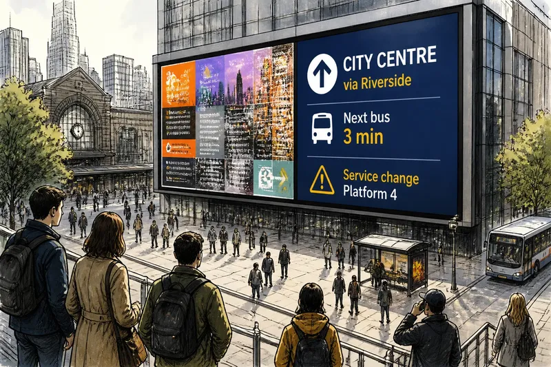
Scrolling text versus fixed panels changes what a passerby can understand in one glance. At a transit entrance, library lobby, or plaza, the right choice depends on whether the message can arrive in a clear sequence or needs its details visible together.
Decide what one glance must communicate
Start with the single thing a passerby should remember: a room change, a meeting time, a direction, or the name of a service. If the message needs several facts, decide which one matters most before choosing a layout.
Keep essential details connected. A room number may need its building name, and an event time may need the event title. Supporting information can follow, but a viewer should not have to catch another screen or wait for the rest of a sentence to understand the main point.
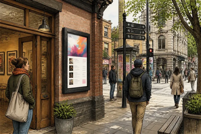
Consider how people encounter the display. Someone waiting in a lobby may look more than once; someone crossing a plaza may see it only in passing. The likely viewing direction, nearby activity, and whether viewers can pause all shape how much information the screen can reasonably carry.
Make each fixed panel understandable on its own
A fixed panel shows its information together, which helps when a message pairs a name with a detail. Keep the wording compact, give the main point visual priority, and leave enough breathing room for the text to read clearly.
For example, “Community meeting — Cedar Room — doors open at 6” works as one unit. If the display rotates through several notices, each panel should still make sense to a person who sees only that one.
Use line breaks to clarify meaning rather than decorate the screen. Keep a place name with its directions, and avoid splitting a short phrase across panels when it needs to be read together. A fixed panel can still be hard to absorb if the copy is dense, the contrast is weak, or the background is crowded.
Use scrolling text only when meaning survives in sequence
Scrolling text presents words over time, so it suits a short message whose meaning remains clear as it passes. A brief direction or announcement may work if a viewer can catch the essential phrase without seeing every word. Motion should carry information, not turn the message into a moving puzzle.
Read the draft as if you joined it halfway through. If the first visible fragment is meaningless, a passerby may need to wait for another pass. Put a useful name or action early, and keep related words close together instead of separating them across the scroll.
Think of the display like a door that opens in sequence: someone arriving late should still be able to tell what is happening. The message can add detail afterward, but it should offer a recognizable anchor first.
Compare both formats in the place where people will see them
Once the core wording is set, prepare a fixed-panel version and a scrolling version with the same essential information. If the display team can preview them safely through its normal process, check how each reads from the places people naturally look. Notice whether motion competes with nearby movement or signs.
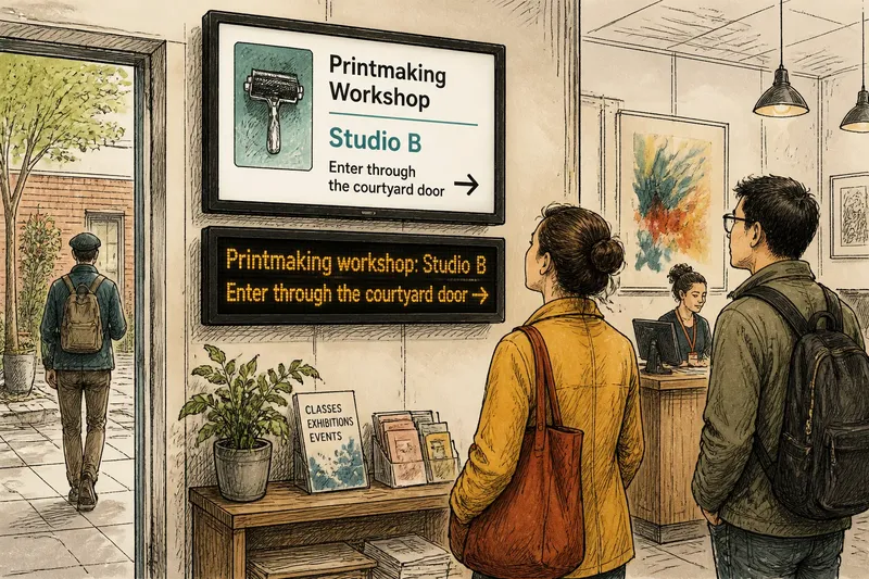
Imagine a neighborhood arts center needs to announce that a printmaking workshop has moved. Start with the draft, “Tonight’s printmaking workshop has moved to Studio B; enter through the courtyard door.” Put the workshop name, Studio B, and the entrance direction together on a fixed panel. For the scrolling version, place “Printmaking workshop: Studio B” first, then the entrance note; the expected observable result is that a brief glance reveals the new room, while a longer look can pick up the direction. If a preview makes the room change unclear, revise the wording or use the fixed panel.
Ask a colleague unfamiliar with the draft to describe what they understood after a glance, without explaining the intended message first. This editorial check cannot predict every passerby’s response, but it can expose a missing detail. If the colleague omits something essential, make it more immediate or choose a format that keeps related information together.
Choose the format by what a reader can miss
Fixed panels are often the better fit when a reader needs paired facts at once: a location and direction, a service and its hours, or an event and its venue. They also suit rotating notices if each panel makes sense independently.
Scrolling text can work when a message is short, naturally ordered, and useful even if someone catches only its central phrase. It is less suitable when a sentence depends on a final condition or when a reader must compare details shown at different moments. Avoid motion simply to squeeze in more copy.
Sometimes neither format fits. If a message contains several instructions or requires careful reading, use the display to direct people to a staffed information point or a stable printed notice. The screen can identify where to find the full information without asking every passerby to read it all.
Questions readers ask about pacing a public message
When should a public display use scrolling text?
Use scrolling text when the message is brief, ordered, and recognizable from its central phrase. If understanding depends on reading every word in sequence, use a fixed panel or another way to share the full information.
When are fixed panels easier to understand?
Fixed panels help when related details need to be visible together, such as a venue and a direction. Each panel in a rotation should also make sense to someone who did not see the previous one.
Can scrolling text carry more useful information?
It can show more words over time, but a brief viewer may not see them all. Keep the most useful point easy to catch early, and include extra wording only when it helps someone act.
What should happen when a message is too long for either format?
Keep the display focused on the most useful immediate fact, then direct people to a suitable source for the rest, such as a staffed desk or an available printed notice. Essential instructions should not depend on catching a long passage while passing by.
Make the final choice match the message
Before publishing, check that the main fact appears early, names and directions stay together, and no essential detail exists only in a moment a hurried viewer could miss. Remove wording that describes the announcement instead of helping someone act on it.
Record why you chose the format: the message needs simultaneous details, or it can be understood in a clear sequence. Keep the wording separate from the layout so a later editor can update the room, time, or route without inheriting an old arrangement blindly. For scrolling text versus fixed panels, ask what a person can miss and still understand; that answer should guide the pace.