The Screen Is Part of the Street Scene
Learn how a public display’s frame, surroundings, and viewing distance shape its fit with a place, so you can spot placement problems and adjust them.
A public display can feel out of place even when its message is clear. The screen’s frame, the surfaces around it, and the distance from which people see it all tell passersby what kind of place they are in—and whether the display belongs there. A screen that suits a transit concourse may look jarring beside a quiet library entrance, while the same display can feel natural when its form and position echo the street around it.
When a display seems awkward, the cause is often not the content alone. Treat the screen as one element in a street scene, like a shop window or a bench: its edges and neighbors influence how people read it. Troubleshooting that relationship begins with noticing what feels wrong, identifying the likely cause, and making a focused adjustment.
When the display looks pasted onto the place
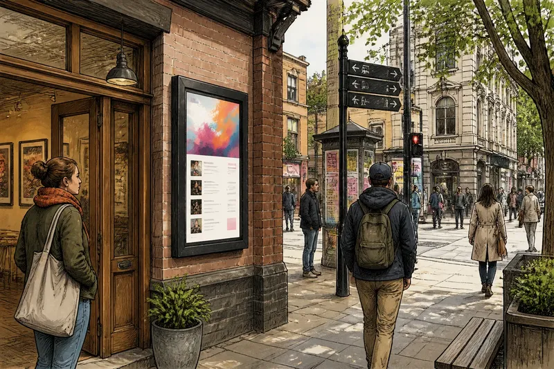
A screen can appear to float above its surroundings when its frame has no visual connection to nearby materials or architecture. A glossy black border against warm brick, for instance, can draw attention to the equipment rather than to the place. That contrast may be intentional, but if the display feels like an afterthought, the frame is a useful first place to look.
Compare the screen’s outline, finish, and mounting with nearby features. Does the frame repeat a shape already present in a doorway, canopy, or sign? Does its surface seem compatible with the materials around it? A display need not imitate the building, but a considered relationship helps it read as a deliberate part of the scene.
- What you notice: The display looks like a loose panel attached to a wall.
- What may be causing it: The frame is visually heavy, highly reflective, or unrelated to the surrounding architecture.
- What to try: Consider a slimmer or less reflective surround, or adjust the mounting so the screen aligns with existing edges. If the frame cannot change, give it a clearer relationship to the wall through placement rather than adding decoration that competes with the display.
Imagine a neighborhood arts venue with a digital noticeboard fixed beside its entrance. If the thick, shiny frame clashes with a simple timber doorway, the venue could consider a quieter finish and position the display in line with the door trim. The expected observable result is that the screen feels more connected to the entrance, while still standing out as a noticeboard.
When nearby signs compete with the screen
Even a well-framed display can lose its place in a crowded field of visual cues. Directional signs, storefront lettering, posters, traffic signals, and bright windows all ask for attention. If the screen sits amid them without a clear role, people may glance past it or struggle to tell which sign matters for their next move.
Look at the scene from the route people actually take, not only from directly in front of the display. Notice which elements appear together as someone approaches, turns, or waits. A screen positioned beside several urgent wayfinding signs may be competing at the very moment people need to make a decision.
- What you notice: People look toward the screen but keep scanning nearby signs, or the display seems to disappear among other bright elements.
- What may be causing it: The display shares a sightline with cues that have a more immediate purpose, or its visual emphasis is similar to theirs.
- What to try: Shift the display away from the busiest cluster, or position it where people naturally pause after making a turn. Keep essential directional information easy to distinguish from promotional or ambient content.
Think of the scene as a table: if every object is pushed into the same corner, it is hard to pick out any one of them. Separation can create clarity without making the display larger or louder. The goal is not to remove all visual neighbors, but to give each element a legible place in the whole.
When the screen seems too close or too far away
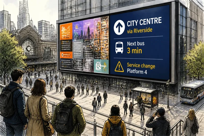
Viewing distance changes how a display relates to its setting. From nearby, a screen may feel like a personal notice or a shop fixture. From across an open plaza, it may read as a landmark or part of the building’s facade. A placement that works from one position can feel oddly scaled from another.
Observe the screen from several points along the approach. At what point does it become visible? Where do people naturally stop, and where do they need to keep moving? If the display is tucked behind street furniture or a column, it may appear suddenly at close range. If it dominates a small passage, it may feel oversized even when its physical dimensions are modest.
- What you notice: People only see the display when they are already beside it, or it takes over a narrow walkway.
- What may be causing it: The display is placed outside the natural sightline, or its apparent scale is out of step with the space and the usual viewing distance.
- What to try: Test a position visible from the approach without blocking movement. For a screen meant for close viewing, place it where a person can stop without disrupting the flow; for a display intended to be noticed from farther away, consider the surrounding architecture and likely sightlines before increasing its visual prominence.
Distance is not simply a matter of making text readable. It also affects whether a screen feels like a useful part of a route, an interruption, or a destination. A display near a queue can be read as part of a waiting area; the same position beside a fast-moving crossing may feel intrusive.
When the display belongs to the wrong activity
A screen can be in a physically suitable spot yet feel socially misplaced. A lively, animated display beside a quiet reading room may jar with the behavior people expect there. A subdued directory placed where visitors are gathering for an event may be too easy to overlook. The mismatch comes from the activity surrounding the screen, not just its appearance.
Watch how people use the space before deciding what to change. Do they hurry through, wait, meet someone, browse, or look for directions? Consider whether the screen sits within that activity or cuts across it. A display near a place to pause can support leisurely attention; one at a bottleneck can add friction even if it is attractive.
- What you notice: People avoid the area around the screen, seem startled by it, or pay attention only after leaving the place where its message would be useful.
- What may be causing it: The screen’s position or presence conflicts with the space’s expected pace and purpose.
- What to try: Move it toward a natural pause point or a relevant threshold, such as the edge of a lobby rather than its narrowest passage. Consider whether a quieter physical presence would better suit the setting.
For a public display, “part of the place” does not mean invisible. It means that the screen’s presence makes sense alongside what people came to do. A library, market entrance, and transit platform each invite different kinds of looking and waiting, so the same placement choice will not suit every site.
When reflections and background surfaces distort the scene
Glass, pale paving, polished stone, and bright shop windows can alter how a screen appears. Reflections may make the display seem washed out or turn its dark frame into a mirror. A busy mural or strongly patterned wall can also make the screen’s edge difficult to distinguish, leaving it visually tangled with the background.
Check the display in the conditions and positions that matter to its setting. Look from the approach, from a typical stopping point, and from the side. Notice whether reflected light, glare, or a high-contrast background changes its apparent shape or draws attention away from the message.
- What you notice: The screen’s surface reflects its surroundings, or its outline blends into a patterned facade.
- What may be causing it: The viewing angle and nearby reflective or visually busy surfaces are working against the display.
- What to try: Consider a different orientation or a position with a calmer background. A less reflective surround may help, but avoid adding a bright border that becomes a competing feature.
When a change affects a fixture, mounting, or public route, check the property owner’s requirements and the applicable local rules before acting. The right option can depend on the site and the display system.
Which placement questions help diagnose the scene?
Should a public screen match the building around it?
It does not need to copy the architecture, but its frame and position should feel considered beside nearby materials and shapes. A clear contrast can work when it has a purpose; an accidental clash often makes the equipment seem detached.
How can I tell if the screen is too close to people?
Observe whether people have room to pause and look without blocking a doorway, queue, or walking route. If the display is encountered only at close range or dominates a narrow passage, its position may be too intrusive for the way that area is used.
What should I change first if several things feel wrong?
Start with the screen’s position in the scene, since moving it can change its relationship to sightlines, activities, and nearby signs at once. Then reassess its frame and background before considering a more conspicuous design change.
Can a display be noticeable without disrupting the street?
Yes, if it is visible from a useful approach and placed where looking at it fits the flow of the space. Noticeability comes from a clear relationship to its setting, not only from brightness or size.
Make one placement change and read the scene again
When a display feels out of place, resist changing several things at once. First identify the strongest mismatch: the frame, its visual neighbors, the viewing distance, the activity around it, or the background. Then consider one adjustment and look again from the positions where people actually encounter the screen.
The useful question is not simply whether the display attracts attention. Ask whether its presence makes sense at that point in the street, and whether people can notice it without losing their bearings. That is the practical test of whether the screen has become part of the scene.